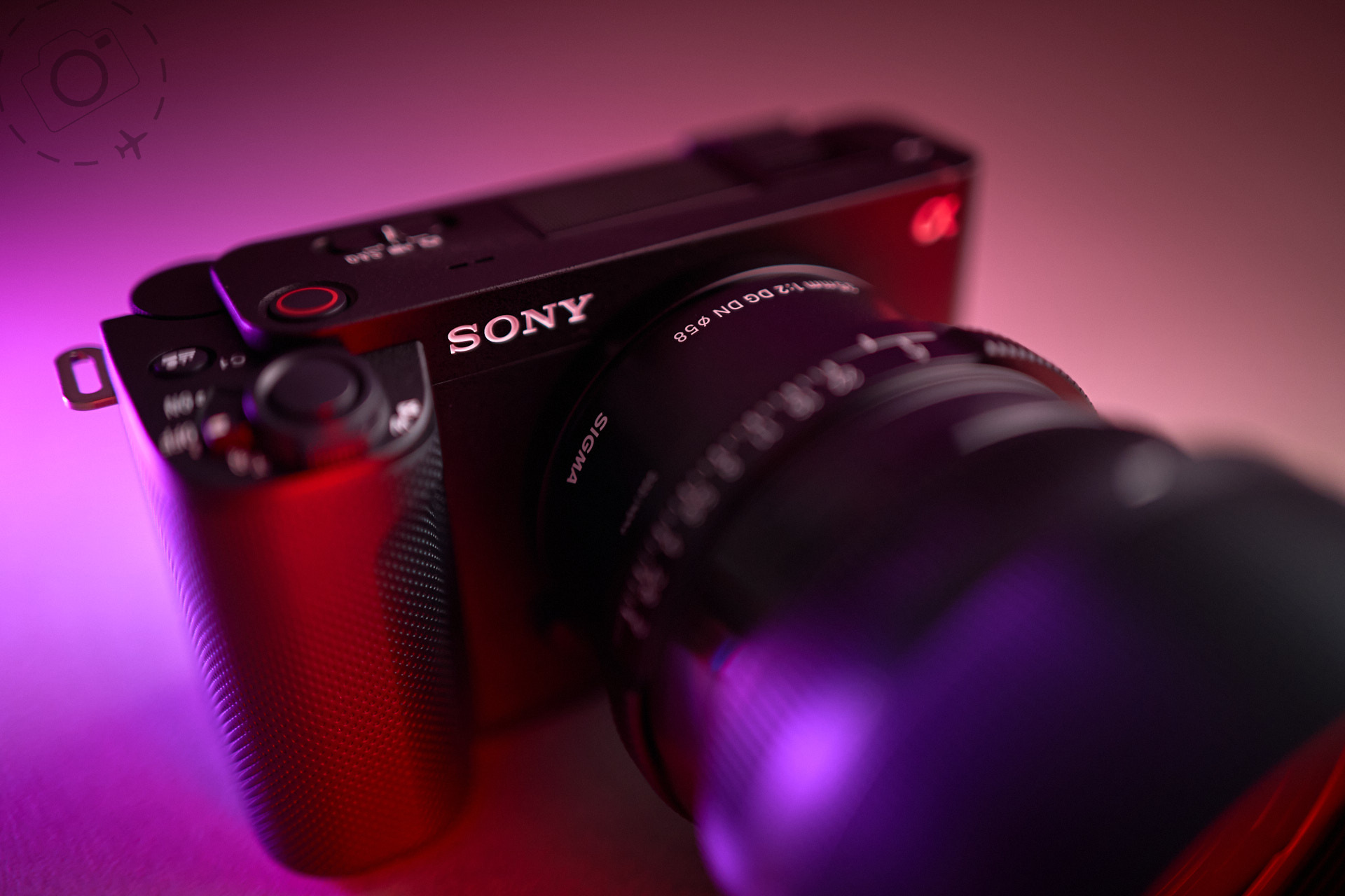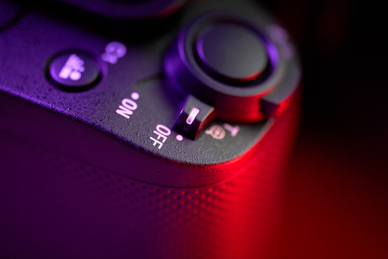
Sometimes you just have to call it as you see it. I prefer to share my insights into what does work than what doesn't, but Sony deserve a whack around the chops with a wet haddock for foisting this monstrosity of a menu system upon their customers. I have a proper long term review of the ZV-E1 on the way, but in the meantime I need to vent about the pure tragedy of the user interface on this camera.
I spend a lot of my life helping other people to get the best from their cameras. I work with all the brands. Years spent reviewing camera gear for magazines has given me and appreciation for the differences between some of them. As a general, there are no bad cameras these days... But there are terrible menu systems. And Sony deserve an award for being so awful, for so long.
Just how bad is the Sony user interface on the ZV-E1? Really really really bad. After spending two months on the road wit the Sony ZV-E1, I've can honestly say never seen a camera that is so darned good yet crippled by a user interface that is so incredibly dysfunctional. It’s genuinely awful.
ZV-E1
I cannot say for sure if the ZV-E1 is absolutely typical of the entire Sony range, but it is one of their most recent releases and their cheapest in the full-frame range. This would have to be one of the worst cameras to try and learn about photography or videography with. The menu system is so bad on the Sony that I'll suggest no beginner should go near them. If you are a seasoned professional with experience and skills already then fine, you can suffer the consequences with a free will.
Sony have put their emphasis is on flexibility instead of usability. The net effect is a stunningly capable camera that requires the tolerance of a saint to get the best of it. We're not just talking about an ugly interface, but there are key features completely missing, such as setting a shutter angle or setting defaults for tracking modes.
Setting up this camera from scratch is a major undertaking. You never know if you're looking in the wrong place for a feature, or just looking for something that doesn't exist. It's hard to fathom how so much investment goes into engineering the sensor and other hardware, and yet so little goes into the user interface that glues it all together. I started to make a comprehensive list of all the faults and failings in the menu system, but I simply ran out of time.
Mess of Menus
The overall problem looks to me that Sony keep bolting new features onto the unholy mess of a menu, and with each new camera the chaos escalates. Instead of rethinking how to harness all the new features and integrate them properly, they just get whacked on like an oversized bandaid. There are layers of “quick access” menus, deeper menus, configuration menus and mode menus. Some features can be accessed from different menus, each with unique behaviours on screen. It’s a hot mess.
To be clear, this is one heck of an amazing camera. It beats so many rival models for features and performance – cameras that cost a lot more than the ZV-E1. There's immense innovation tucked inside this body, but the entire user interface and menu system let's it down so badly. I’ve had to learn new swear words just to keep up with how frustrating the camera is.
If you're NOT planning to switch between a bunch of modes then you may be fine with some of the limitations. But if you want to get the best out of the ZV-E1 you’ll have to be ready to wrestle it to the ground and apply a choke-hold before it submits to your will. And even then it’ll probably spit it your face. It's really such a huge shame because the only thing holding back this camera is absolutely fixable.
Won't doesn't work?
- You can't set a shutter angle or minimum shutter speed.
- Custom settings are a hot mess of inconsistent screens and no ability to keep track of what you've stored in there.
- Switching to a new custom setting is unbelievably slow and cumbersome.
- Some recording modes throw an error if you try to record to SD, but the camera can only record to SD.
- 120p upgrade accessed by downloading a licence and may not work in every region.
- Stabilisation crops the image, sometimes as much as APS-C.
- Defaults for tracking vs zone focus are limited and badly implemented.
- Switching frame rates or codecs will drop bitrate to minimum settings, instead of max or just nearest to your previous settings. This may also mean dropping to 8-bit. If you’re not paying attention or didn’t know the camera does that, you may end up shooting a lot of useless footage.
- Gets very very hot pretty much all the time. It could form a support group with my MacBook Pro.
- Remote control via the Android App was buggy to setup and clumsy to use once installed.
- Micro HDMI port.
- Single SD slot.
- Shutter delay on the trigger when shooting stills is unacceptable.
- Quality of rear display is pretty unimpressive.
- 12MP stills makes it hard to compare with fully-fledged stills cameras such as the LUMIX S5II.
What does work
- Full frame camera jammed into a teeny tiny body.
- That autofocus is just stunning and let’s you work with confidence.
- AF tracking is very solid and tuneable.
- The dynamic-active stabilisation is pretty good, but not LUMIX good.
- 50/60/100/120p modes don't crop the sensor.
- "Clear view" zoom takes advantage of the extra pixels in camera to deliver smooth magnification up to 150% on any lens.
- Ability to frame a subject and follow them about by recording 4K with an APS-C sized crop
- Seriously small and we'll packaged hardware and decent battery life.
- Shopping for E-mount lenses is pretty sweet for choice.
- USB charging and live streaming.
- Flippy rear screen always a winner.
- Stills with the 12MP are nicely stabilised and can shoot handheld even at 1/5th of a second with minimal effort.
Sony ZV-E1 vs LUMIX S5II
- AF is a big win for the Sony. I’ve had mixed results with the new phase detect on the S5II, but the Sony AF is just amazing.
- Stabe is way more elegant on the S5II. It feels more natural compared to the Sony.
- The colour science of the LUMIX is a little nicer and needs less tuning in post-production
- 6K on the LUMIX S5II is a sweet bonus compared to just 4K and negates the need for “Clear View” feature.
- 120p on the Sony, with no sensor cropping, is a huge advantage.
- Sony’s Menu needs to be thrown in the dumpster and started from scratch. It’s a nightmare and seriously impacts the usability of the camera.
Photos Essays with the ZV-E1
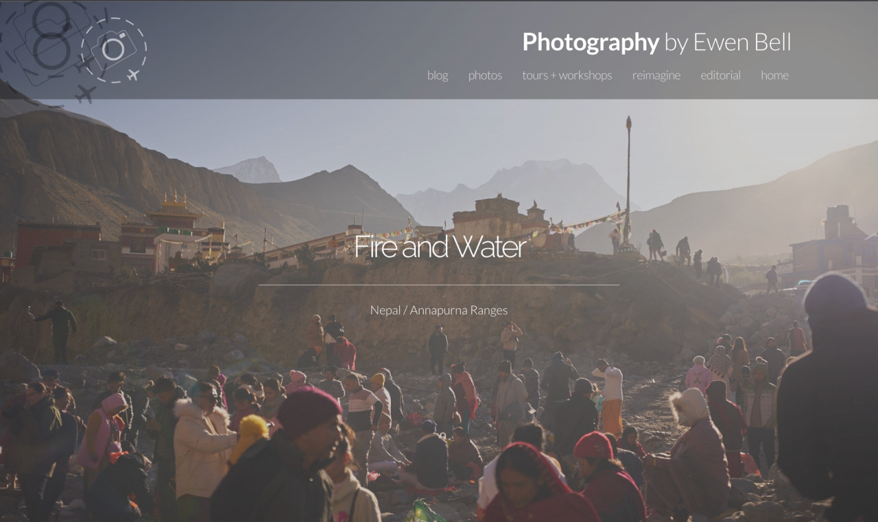
Enjoy a few photo essays captured on the Sony ZV-E1 during my recent travels in the Himalayas:
https://ewenbell.com/editorial/Fire+and+Water
https://ewenbell.com/editorial/Bhakatpur+in+Gold

Keep Reading
Join Ewen's newsletter for monthly updates on new photography articles and tour offers...Subscribe Here

